Data Analytics for Student Success: What Actually Works
Sixty-seven percent of American colleges and universities aren't using the data already sitting in their own student information systems. Not missing the data — not waiting on it — just not using it. NASPA's research laid this out bluntly: institutions collect enrollment records, LMS login timestamps, financial aid histories, advising notes, and course withdrawal patterns, then file them away while students quietly disappear.
And students are disappearing. Only 76% of full-time U.S. college students make it from their first year to their second. One in four enrolls in the fall and never returns for year two. Some transfer. Many simply run out of money or momentum, drift away without a single outreach call, because nobody was watching the right signals.
That gap — between data collected and data acted on — is exactly where student success analytics either proves itself or sits idle.
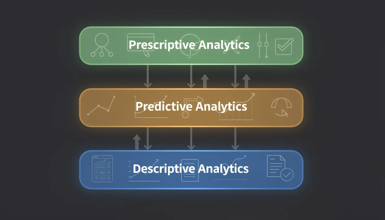
The Three-Layer Analytics Stack (and Why Most Schools Only Use One)
Not all analytics do the same thing, and confusing the layers explains why so many programs disappoint.
Descriptive analytics answers "What happened?" — enrollment by cohort, grade distributions by course, five-year graduation rates by department. It's backward-looking. Useful for spotting long-term patterns, but it can't prevent anything from happening next semester.
Predictive analytics answers "What's about to happen?" — machine learning models trained on historical student data to estimate dropout risk, course failure probability, and financial aid gaps before they become crises. Georgia State University's system ingests over 800 risk variables per student, ranging from whether someone passed Calculus I to how many times they swiped into campus facilities this week.
Prescriptive analytics answers "What should we do about it?" Instead of just flagging a student as high-risk, a prescriptive system recommends a specific next action: route to financial counseling, assign peer tutoring, switch course sections. This layer closes the loop. It's also the rarest.
| Analytics Type | Question | Example Use | Adoption Rate |
|---|---|---|---|
| Descriptive | What happened? | Graduation rate dashboards | Near-universal |
| Predictive | What will happen? | Dropout risk scoring | Growing |
| Prescriptive | What should we do? | Automated intervention routing | Rare |
The gap between predictive and prescriptive is where programs go dead in the water. A risk score in a dashboard that no advisor opens isn't analytics. It's an expensive spreadsheet.
What Early Warning Systems Actually Watch
Modern alert systems pull from several data streams simultaneously:
- LMS engagement: login frequency, assignment submission timing, video completion rates, discussion forum participation
- Academic records: midterm grades, add/drop activity, incomplete grade history, prerequisite failure patterns
- Financial signals: outstanding balances, FAFSA filing gaps, late payment patterns
- Campus behavior: library access, advising appointment frequency, health services utilization (aggregated and de-identified)
Research from the Journal of Learning Analytics found that no-engagement alerts outperformed demographic data as predictors of academic failure. Whether a student logged into their course management system this week tells you more about where they're headed than their zip code or high school GPA. Behavior beats background — and that framing matters for how institutions think about equity.
Studies have shown that at-risk students can be identified with 72% precision and 86% recall using only LMS trace data, as early as week three of a semester. Before a single midterm grade exists.
The most predictive signal isn't a test score or a demographic variable. It's whether a student showed up — digitally or physically — this week.
But accuracy has two sides. At 72% precision, a university of 20,000 students could generate thousands of false-positive flags in a single semester, flooding advisors with unnecessary contacts and potentially stigmatizing students who are doing fine. Threshold calibration and tiered alert severity matter more than raw model accuracy. Most first deployments get this wrong.
The Georgia State Blueprint
If there's a single proof-of-concept that data analytics can structurally change student equity outcomes, it's Georgia State University.
GSU spent years integrating advising records, financial aid data, course performance, and behavioral signals into a unified predictive engine. Those 800-plus risk variables update in near-real-time. When a student's score crosses a threshold, an advisor reaches out within 24 to 48 hours — not with a generic email, but with a conversation tied to the specific risk factor. A student behind on tuition gets connected to emergency aid. A student with three missing assignments gets a coaching call.
The results are hard to argue with. Since building out this system, GSU raised its graduation rates by 22 percentage points — among the largest increases ever recorded at an American research university. Degrees conferred to Black students increased by more than 103%. Latino student degree completion rose over 120%. Degrees to Pell Grant recipients grew more than 90%. Achievement gaps between demographic groups that had persisted for decades were effectively eliminated.
The mechanism matters. Students who received proactive advising outreach graduated at rates 7 percentage points higher than control group peers — and 15 points higher specifically among Black students, according to AACRAO's analysis of GSU's outcomes.
The technology wasn't the breakthrough. The workflow was. Generating a risk score is step one. Getting a trained advisor on the phone with that specific student before week five is step two. GSU built both halves — and that's rare.
For institutions without a dedicated analytics team, platforms like EAB Navigate or Civitas Learning provide similar predictive infrastructure without requiring in-house data scientists. But implementation still typically runs 6 to 18 months, with most of that time spent on data integration and process redesign, not software setup.
The Bias Problem Nobody Wants to Talk About
Here's where I'll take a direct stance: data analytics for student success is valuable, but it is not neutral, and treating it as neutral causes genuine harm.
Research shows that some predictive models under-predict academic success for Black and Hispanic students. The mechanism is structural. Models trained on historical data absorb historical inequities. If systemic barriers historically suppressed grades or reduced campus engagement for certain student populations, the model encodes those patterns as individual student risk characteristics — not as evidence of systemic failure. It learns the past and calls it prediction.
This creates a damaging feedback loop. Students flagged as high-risk receive more intensive interventions, which sounds like help, until those interventions are intrusive, resource-heavy, or stigmatizing in ways that create new burdens. Students who aren't flagged — because their demographic proxies don't trigger the algorithm — fall through gaps a human advisor might have caught.
Concrete mitigations exist and should be treated as non-negotiable:
- Audit model accuracy by demographic subgroup, not just in aggregate. A model with 80% overall accuracy may perform at 60% for specific populations.
- Avoid using race, gender, or income as direct model inputs, even when they correlate with outcomes — other variables will proxy for them, but the feedback risk is lower.
- Monitor for disparate impact over time. Models drift as campus demographics shift.
- Build explainability into the advisor interface. The specific reason a student is flagged should be visible, not just the fact that they are.
FERPA sets the legal floor: limit data collection, secure storage, be transparent with students about how their information shapes decisions. But legal compliance and ethical practice aren't the same thing. The floor is not the ceiling.
Building a Data Culture That Actually Sticks
Technology is the easy part. Culture is where analytics programs live or die — and most die here.
The NASPA finding — two-thirds of institutions not using their own SIS data — points to a human and structural problem, not a software deficit. Universities have data warehouses. They often don't have shared understanding among advisors, faculty, and department chairs about what action should follow a flag, or why the data exists in the first place.
Advisors frequently view analytics dashboards as surveillance tools or administrative noise. Deploying a new platform without addressing that perception is how you get a six-figure purchase collecting dust by March.
What distinguishes programs that actually take hold:
- Advisor buy-in comes before administrator mandates. People who helped design the outreach workflow use it; those who had it imposed on them find workarounds.
- The default action must be obvious. "Student is at risk" isn't actionable. "Student is at risk — click to schedule a 15-minute check-in call" is.
- Staff need to see outcome data closing the loop. When advisors learn that the students they contacted in week three passed the semester, they trust the system more the next time they see a flag.
- Data literacy training should be institution-wide, not just for the analytics team. Faculty who spot a struggling student need to know how to enter a referral and what happens after they do.
The AIR, EDUCAUSE, and NACUBO "Change with Analytics Playbook" (a joint resource from three major higher education associations) is worth reading before buying anything. It focuses heavily on change management — which is exactly backwards from how most procurement conversations go, and exactly right.
Bottom Line
Data analytics for student success works. But only when the full cycle completes: collect meaningful signals, build accurate models, act on them before the semester is half over, and then measure whether the intervention changed anything.
The institutions getting real results share a few habits:
- They invested as heavily in workflow design as in technology — who gets the flag, what they do with it, how quickly.
- They audited for model bias and built human review into the intervention path before scaling.
- They started narrow — one at-risk cohort, one risk type, one intervention action — and expanded only after proving the loop closed.
The single most important step most institutions should take right now isn't buying a new platform. It's understanding why 67% of their existing student data is collecting dust — and fixing that first.
Frequently Asked Questions
What is learning analytics and how does it differ from traditional grading?
Traditional grading measures student performance at fixed points: exams, papers, finals. Learning analytics tracks behavior, engagement, and performance signals continuously across a semester. The goal isn't measurement after the fact — it's detecting a student's change in trajectory early enough to intervene while there's still runway left in the term.
Can small colleges and community colleges actually afford student success analytics?
Yes, and community colleges have been among the most active adopters, partly because their student populations face higher financial and logistical risk factors. Cloud-based platforms designed for smaller institutions exist across a range of price points. The "Change with Analytics Playbook" from AIR, EDUCAUSE, and NACUBO was written with under-resourced institutions specifically in mind and is freely available.
Myth vs. Reality: Does more data always produce better student outcomes?
Myth. The NASPA finding — 67% of institutions not using their own SIS data effectively — proves it directly. Most schools aren't constrained by data scarcity. They're constrained by limited analytical capacity, unclear action workflows, and insufficient institutional will. Adding more data streams to a broken process produces more noise, not better outcomes.
What is the most predictive early signal for student dropout risk?
Based on current research, LMS disengagement — specifically students who stop logging in or submitting work during weeks two through four — is among the strongest early predictors. It outperforms demographic variables and gives advisors enough lead time to intervene before the semester's midpoint, when intervention success rates drop significantly.
How long does building a real student success analytics program take?
A basic early alert tool using an existing platform can go live within a few months. A full integration connecting LMS data, financial aid, advising records, and course performance typically takes 6 to 18 months. The bottleneck is almost always data cleaning and system integration, not the software itself. Institutions that rush this phase end up with inaccurate models that erode advisor trust — and those programs rarely recover.
Are students informed that their data is being used this way?
FERPA requires that institutions limit data use to legitimate educational purposes and protect student records. But transparency beyond the legal minimum is both ethically sound and practically useful. Students who understand the system exists to connect them with resources — rather than to surveil or assess them — are more likely to respond to outreach. Some institutions now give students direct access to their own risk score dashboards, reframing the tool as something the student can act on, not just administrators.
Sources
- The Role of Data Analytics in Transforming Higher Education | Element451
- Predictive Analytics in Higher Education: Full Guide | Edvisorly
- Approaching Student Success With Predictive Analytics | Georgia State University
- How Georgia State Has Increased Graduation Rates and Eliminated Achievement Gaps | AACRAO
- Data Analytics: The New Imperative for Higher Education's Future | CampusID News
- Enhancing Student Success with Data Analytics in Higher Education | Stevens Strategy
- Early Alert Systems and Student Retention | Journal of Learning Analytics